Brand Guide
The blueprint for presenting ourselves across the world.
It’s often said that appearances mean everything, but for us, it's more than just that - it’s a symbol of our relentless pursuit of perfection.

It’s often said that appearances mean everything, but for us, it's more than just that - it’s a symbol of our relentless pursuit of perfection.
Our brand resources are your central hub for downloadable logos, icons, color standards, and essential assets. Designed for partners, media, and integrations, these guidelines ensure every use is consistent, cohesive, and unmistakably aligned with our brand guidelines.
Our logo is a core asset and must be used with precision and consistency across every application. This guide establishes the standards for how our brand is presented—protecting its integrity, reinforcing recognition, and ensuring only approved products, services, and partnerships carry our mark with clarity, accuracy, and purpose.
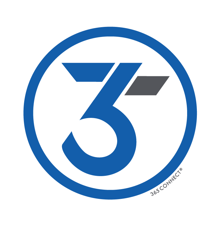
Over the years, our logo has evolved to reflect a legacy of innovation and a focus on making time work smarter. Designed as a unified “365” mark, it symbolizes continuity, efficiency, and performance—serving as a visual testament to the time-saving solutions we deliver that power discovery, leasing, and living experiences across communities worldwide.
We invest significant resources in developing and protecting our intellectual property. In addition to registering our trademarks and logos, we actively enforce our rights against unauthorized use. We reserve the right to revoke permission to use our marks at any time and may withhold approval for any use that does not align with our brand guidelines.